
might make sense to notify the educational institution she was said to be attending.


might make sense to notify the educational institution she was said to be attending.


No I’m one of those “think!” nutjobs


But obviously instances blocking other instances is part of it.


We’re trying to have an intelligent discussion here.
You think every Lemmy admin should be forced to fed with CSAM instances, and therefor host on their own servers CSAM? Wow great plan you have for expanding the fediverse.


deleted by creator


frustrating to learn to find
So when you are pointed at a mega threads that is 2k posts long over 10 years, where you are told the answer is, how do you attack it? LearnEd one.


Ha. have you seen the looneys here on Lemmy asking for signatures?


The point of social platforms is to be social.


Agree. And there are cultural issues in forums that make them really annoying. Some forums like to consolidate topics into mega threads like “if you have questions about xyz go to the xyz mega thread”. Then you go there and its a 300 page chronology starting in 2008 of completely disorganized conversation. 20 posts per page with no way to read it more easily.
You could do that on reddit with a pinned post but usually mega threads were at least limited to daily/weekly/monthly instead of indefinite.


It would be solved for people who are primarily interested in tech and gaming. How about bellow challenges?
Gaming is huge so presumably lots of gamers are interested in the wider world, which is not exactly well represented here compared to the major platforms.
And we can’t ignore the inherent complexities of federation. If a user signs up to another instance but for some reason that instance (or game 's instance) is blocked by others or even goes offline, then it will be confusing if not ruining of their experience.


boooooo crypto yuck


Could be using CSS position: fixed. But idk there could be other more sophisticated ways to accomplish the same thing.
In terms of why to not use it, I can think of reasons to avoid it by default. Like it could be very annoying on some devices in some situations. If the page authors made the table headings really long, it could obscure the content. I know I have been annoyed by this sort of thing when websites use position: fixed for their navigation or other elements. When I’ve snooped around the backend of wikipedia I see that they are contending with a wide variety of contributors and users and whatever they do needs to accommodate everyone.
What I find surprising is that there is (apparently) no 3rd party browser extension, userstyle or userscript that allows enabling this.


It sucks because the info is all there! Someone has gone to the trouble to put it in and everything.
Like I said in the top post I honestly don’t understand how these large tables even get updated… How do the authors know what they are even editing?? There has to be a trick.


Freezing the top row (when wanted by the user) would be an actual legitimate use of that annoying thing where websites have their navigation bar persistently at the top of the window.


Thanks for taking the time! But it doesn’t properly reproduce the content.
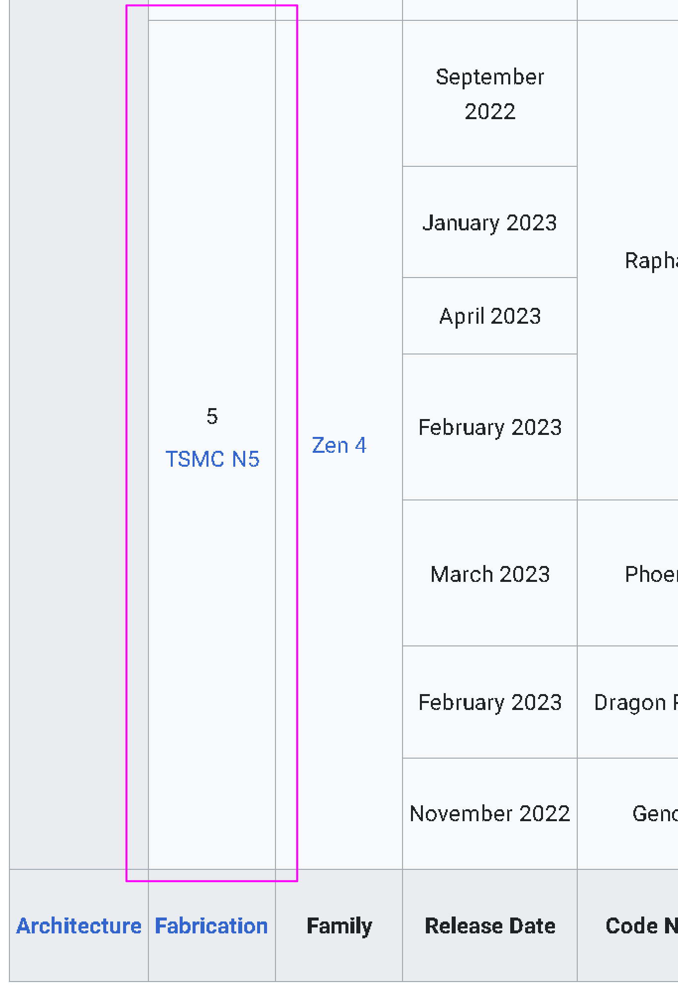
As an example, here is the very bottom left corner from the wikipedia:

there is a merge row with content “5 TSMC N5”. Same height as merged row in next column, with content “Zen 4”.
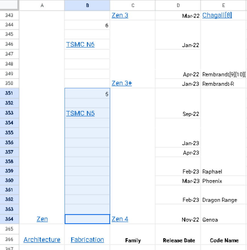
But in the google sheet:

those row containing “5 TSMC N5” have all be un-merged into 14 separate rows. However for some reason “Zen 4” has been properly copied?
I would need 2+ very large displays to compare the two documents side by side but from what i can see on my 1 small display there are many such inconsistencies. My experience is that cleaning up the data is impossible.
don’t mystify