I am so confused as to why anyone gives a fucking shit about this.
Wait a minute. The logo is literally a cracker and a barrel 🤣. I’m surprised conservatives are ok being made fun of.


Who gives a shit about a logo??? Companies can do whatever the hell they want with their logos so shut up about it and start asking: WHERE’S THE EPSTEIN FILES???
Probably not at Cracker Barrel, but I suppose anything’s possible.
Trump stored those stolen documents he was selling to the Saudis in a bathroom. You never know where he hides documents he absolutely has.
Lol.
Boomer oriented company chooses to stay in business for a few more years until boomers are all gone.
I went into a Cracker Barrel once. 90% elderly.
The backlash from the racist bigots you mean. Where else are they going to go after church to be mean to the wait staff
The title already says Conservative though.
Yeah. But fuck em. Call em what they are.
No bigger snowflake than a MAGAt.
I will continue to not care at all about it. Release the Epstein files.
The reaction has been absurd, but their new logo was definitely awful.
I don’t think that the old logo is great either, and the update did improve on technical aspects. You don’t want to have all that small text, for example. And generally, simpler logos are preferable.
But…their shtick is a rustic feel. Whatever you can say about the original logo, it did evoke that. I have a hard time seeing the new one doing that.
EDIT: I also think that this compares favorably to another controversial recent rebrand: Musk rebranding Twitter, which was generally seen as not a good idea; Twitter already had a strong brand identity. People weren’t happy and Musk went right ahead with it regardless. At Cracker Barrel, the initial response was “calm down, it’ll be okay”, but they were willing to second-guess themselves, even though I expect that there were people there who were invested in the rebrand.
EDIT2: They’d also done smaller, more incremental changes to the logo in the past, because the “Old Country Store” text had had its typeface changed at some point in the past.
EDIT3: Here’s a more-comprehensive history:
https://dwglogo.com/cracker-barrel-logo/

If they’d just textured the background shape to actually look like a barrel it would be pretty good actually.
I do find it amusing that the “classic” logo everyone is pining for is from the “ancient” year of 1997…
Tbf as weird as it sounds, ‘97 is vintage now
Officially 28 years ago
I hate you for pointing that out.
Counts on hands… Oh yeah, it’s over 10 years now isn’t it?
I think there’s a mistake, other sources say 1977 instead of 1997…
According to another site, the logo was 1977, not 1997. Which tracks with another article mentioning a marketing person coming up with the design in the 70s
On the long drive to and from vacation last week I noticed the 2024-25 picture used a lot and I thought wait they already have a version without the other stuff and it looks fine so why the hell are they changing it again when its perfectly fine the way it is? My biggest complaint of the newest one was just that it featured no border. It already looked weird, but without that border, it just didn’t work at all.
Kinda wish the public had a similar outrage when Fruit of the Loom modernized their logo in 2000, lol
I just wish they didn’t try to gaslight humanity into believing there was never a cornucopia
I’m more upset about Mr Pringle.
Lost not only his hair, but the twinkle in his eye, poor chap.
Who gives a fuck? Let’s focus on the fascist takeover happening in every city in the country, and the billionaires almost completely winning the war on the populace.
Jesus, we’re allowed to think about other things every so often, it doesn’t have to be US politics 24/7
I mean, the headline literally talks about conservative snowflakes, it’s kind of related
How was it awful?
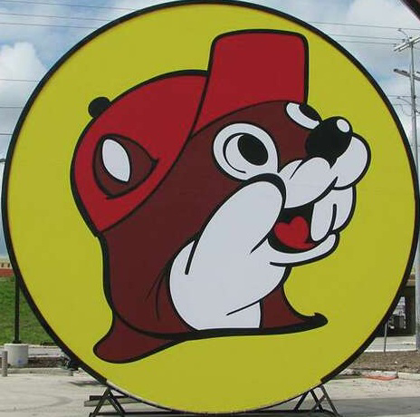
Could you tell me what the heck this yellow blob shape is supposed to be?

From a purely graphic design perspective, the classic logo is too busy and doesn’t scale well. The only thing it has going for it is the weirdness of the shape and the distinct color combination. It’s technically a really bad logo. You may not prefer the new logo but, technically, it’s a whole lot better. It’s far more adaptable to newer platforms while stilling being recognizable. Now, as far as being an effective representation of the brand and if that’s a corporate concern, I don’t know that I can comment on that.
In another post about this, someone posted a bunch of other fast food logos, and they all looked very much the same, especially in silhouette. They’re all just a same-y blend of mediocrity, whereas the existing logo was at least unique.
McDonald’s probably has the best and most distinctive logo out of anyone.
Who cares
The yellow blob is a pinto bean. :)
I thought it was some splooge.
The barrel ain’t just full of crackers
Yellow blob is obviously a speech bubble.
I don’t know if you’re serious or not.
I’m not. I know nothing about this brand or culture lmao
Its not a speech bubble, its what the awful food will look like coming out on the other end of the tunnel
Lmfao
It’s somebody who sees the white guy and a barrel and said them two together.
100%, right here.
It was fine, Jesus Christ
Were it not for the whiny fucking losers and their incessant bitching and moaning over everything, I wouldn’t have know nor cared.
I still don’t care.
I’m not conservative in the slightest and I thought the redesign was completely ass.
Yes, but did you go unhinged calling it “woke”? The logo was a poor fit and I could get behind it, but so many MAGAs losing it over calling a lame logo “woke”…
“woke”
Yes
“woke”

The whole restaurant is complete ass.
Thank god! Now can we get back to the important issues? How’s that WAR ON CHRISTMAS going?
I’m still fighting the good didn’t against it until Lowe’s put up a Halloween display in fucking August!!! Now it’s just about containment. If we can keep them in their own months I would be happy
The war on Christmas CANNOT END until Christmas ceases its illegal occupation of November.
We are once again calling on the Claus regime to return to their side of the borders outlined in the Black Friday agreement.
There are xmas decorations in stores right now. And it was very funny to hear the Halloween decorations making spooky noises at them. I hate this badly written episode of Star Trek!
November? I think you forgot to include September and October.
So the war on Christmas is odd on a theological and economic level. The secular (pagan?) Side is driven by corporations not the woke left. A fact often ignored by the evangelical right.
So what solution do they even want? A commercial with Jesus on the cross saying he thirts and having a Roman soldier pass him a chilled and refreshing coca cola?
Maybe a nativity where one of the wisemen is like and we got something for Joseph too and hand him a power saw?
Wtf
Not the route I thought you were going with that.
It started because Starbucks had a disposable cup without the words Christmas on it. It was a generic Holiday cup they used through Nov-early Jan. Suddenly we are under attack! Very stupid.
I think the anger over saying ‘happy holidays’ instead of ‘merry christmas’ predated that, because christians have found a way to get outraged over everything for a looong time. I was pretty happy just this week that dobson died, because focus on the family underpinned a lot of those sentiments that passed through the american christian sects.
I thirt
I just want people to start complaining about “x-mas” again so I can explain very slowly what the Greek letter Chi is.
Good luck with that. The explaining part, I mean.
I’ve had xtians hound me on various forums for using their own abbreviation, LOL. Even after explaining it to them, they’d still get worked up into a poutrage, deny what I told them, which was obviously true, and, at least on Denver Post forums, run to the mods to try to get me banned and/or my posts taken down.
I’ve already fired my first salvo. By now I would have had at least three or four gifts already purchased and ready for the Christmas season. I haven’t even bothered. And I won’t. It’s going to be a lean Christmas and it’s going to hurt the capitalist assholes who are fucking up our country.
deleted by creator
I’ve never seen people freak out so hard over a LOGO change. Jesus, it’s not like they changed the typeface to Comic Sans or Papyrus or some shit!
Because everything in the United States has been turned into “us vs them” crap.
Bunch of snowflakes wanting their safe space
Nothing wrong with Comic Sans. It’s highly readable for many people.
I’m this house we cryptographically decipher wingdings like god intended!
deleted by creator
Jaguar cars: am I a joke to you?
Jaguar was less about the logo and more about that whole marketing campaign. It was like they were doing a cologne commercial and left out the car completely. The logo change was the least of it.
When we did finally see the car, it looked like an AI generated concept, not an actual car. :(
It was really shit rebrand though