The Belfry
  • Communities
  • Create Post
  • heart
    Support Lemmy
  • search
    Search
  • Login
  • Sign Up
antonim@lemmy.dbzer0.com to 196@lemmy.blahaj.zone · 2 years ago

ancient Greek Firefox rule

lemmy.dbzer0.com

message-square
37
fedilink
568

ancient Greek Firefox rule

lemmy.dbzer0.com

antonim@lemmy.dbzer0.com to 196@lemmy.blahaj.zone · 2 years ago
message-square
37
fedilink
alert-triangle
You must log in or register to comment.
  • Ghostalmedia@lemmy.world
    link
    fedilink
    English
    arrow-up
    134
    ·
    2 years ago

    Salty old designer’s 2¢

    I think the new icon scales much better. The fox’s head has turned, and the snoot is easier to see when it’s small / far away. Also, the tail flame is more exaggerated, and it is also more apparent at a small scale.

    The globe is kind of lost now. It just feels like a random purple ball, but scaling that down allowed the designers to play up the tail flame.

    All in all, I dig it. Complex gradients and shapes are not great for logos. Never has been. That stuff is hard to work with when you start putting logos on signage, fav icons, etc. Simple logos have always been more practical.

    And that said, simple is very very hard to do well. It’s clear that they spent a LOT of time on every little curve and detail with this thing. I think the designer did a nice job of preserving the history while giving Mozilla’s design team something that will be easier to work with.

    • aluminiumsandworm@kbin.social
      link
      fedilink
      arrow-up
      62
      ·
      2 years ago

      absolute buffoon’s 2¢ here

      fox cute

      • casmael@lemm.ee
        link
        fedilink
        arrow-up
        20
        ·
        2 years ago

        uwu

    • yetAnotherUser@feddit.de
      link
      fedilink
      arrow-up
      22
      ·
      2 years ago

      I know I’m completely butchering the color palette here, but I’ve finally realized what I felt was missing from the new logo. In the previous iterations, the head was always turned in such a way that you couldn’t see the eyes. Now the head is at an angle where you should see the right eye. But you don’t, the head is completely empty.

      Here’s an “”““improvement””“” making the logo a bit more friendly I think:

      • gothicdecadence@lemm.ee
        link
        fedilink
        arrow-up
        3
        ·
        2 years ago

        Now it looks like it has a mole lol

    • Jumuta@sh.itjust.works
      link
      fedilink
      arrow-up
      22
      ·
      2 years ago

      it’s interesting that people argue about this a lot because firefox has the most complex icon on my home screen

    • Zangoose@lemmy.world
      link
      fedilink
      English
      arrow-up
      15
      ·
      2 years ago

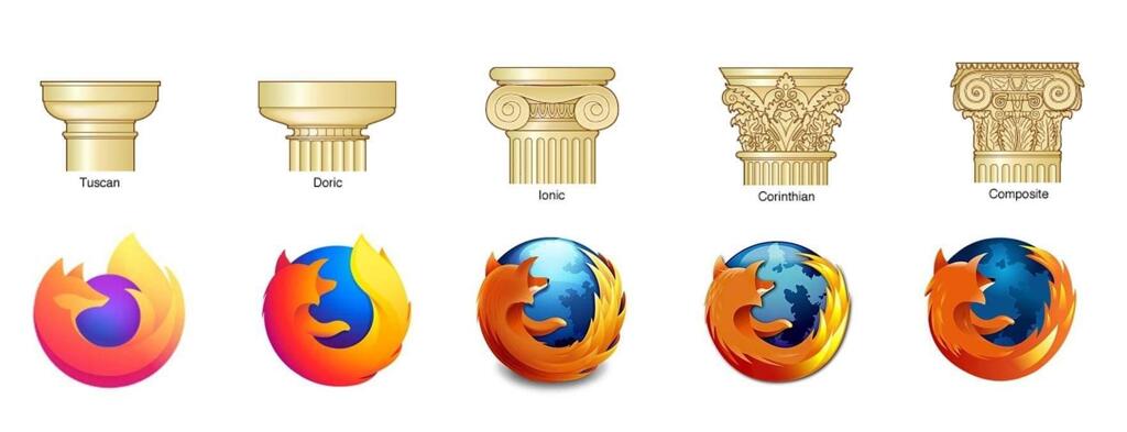
      ^^ imo the logos under the “Doric” and “Tuscan” pillars are my two favorites. I like the slightly more detailed one better than the flat logo, but I completely understand why they changed it and there are some way worse examples of logos getting butchered by becoming too simple.

  • Oha@lemmy.ohaa.xyz
    link
    fedilink
    arrow-up
    75
    ·
    2 years ago

    Am I the only one who likes the new Logo? I mean its simplified but you can still clearly recognize the Red Panda. Plus I like purple

    • Pasta Dental@sh.itjust.works
      link
      fedilink
      arrow-up
      41
      ·
      2 years ago

      You’re not the only one, people especially in niche spheres like Linux are very nostalgic of a certain era in computing and refuse to accept that change happens. For example there are people who absolutely hate apps with the slightest bit of white space even though that was proven time and time again to be more accessible and readable

      • Psychadelligoat@lemmy.dbzer0.com
        link
        fedilink
        English
        arrow-up
        19
        ·
        2 years ago

        Change can happen, that’s fine

        We can also dislike modern logo design trends, those are 2 completely different topics at hand

    • yogaxpto@lemm.ee
      link
      fedilink
      arrow-up
      16
      ·
      2 years ago

      But it is supposed to be a fox!

      • Edymos@lemmy.world
        link
        fedilink
        arrow-up
        14
        ·
        2 years ago

        Actually no

        • yetAnotherUser@lemmy.ca
          link
          fedilink
          arrow-up
          4
          ·
          2 years ago

          My life is a lie

      • Oha@lemmy.ohaa.xyz
        link
        fedilink
        arrow-up
        12
        ·
        edit-2
        2 years ago

        nope
        Edit: Dug a bit deeper and found the answer on Firefox’s website

        • Dangdoggo@kbin.social
          link
          fedilink
          arrow-up
          14
          ·
          2 years ago

          Wow I didn’t know that, the logo definitely looks more like a fox though…

          • Swedneck@discuss.tchncs.de
            link
            fedilink
            arrow-up
            10
            ·
            2 years ago

            yeah i kinda feel like they’re just making it up? like it’s clearly a red fox, red pandas don’t have a long snout like that and are overall rounder.

        • BumbleTumbleGirl@lemmy.blahaj.zone
          link
          fedilink
          arrow-up
          7
          ·
          2 years ago

          ? In the very question you linked they state without a doubt that it’s depicting a fox tho

          “hi, the logo is clearly depicting a fox - however the red panda (common name: firefox) is also a cute mascot for our browser”

          That means they have some red panda mascots (it seems like they use to actually have some live cams that you could watch them on too!) But the logo itself does infact depict a fox

        • MJBrune@beehaw.org
          link
          fedilink
          English
          arrow-up
          3
          ·
          2 years ago

          So it’s a fox but their mascot is a red panda.

      • casmael@lemm.ee
        link
        fedilink
        arrow-up
        2
        ·
        2 years ago

        Actually it’s supposed to be a fox

    • Neve8028@lemm.ee
      link
      fedilink
      arrow-up
      7
      ·
      2 years ago

      I think the one before the current one is my favorite. I feel like the current one is a bit blocky while the previous has a little more detail but still looks good when shrunk down. I don’t hate the current one, though.

    • RachelRodent@lemmy.dbzer0.com
      link
      fedilink
      arrow-up
      4
      ·
      2 years ago

      I like it too, it is just easier on the eyes. There certainly is a trend of minimalism that makes every company try to simplify their logos, but for firefox I feel it does fit nicely

    • Solinus 🌿@lemmy.cafe
      link
      fedilink
      English
      arrow-up
      3
      ·
      2 years ago

      I also like the smooth gradients. I’m a gradient appreciator.

    • xrtxn@lemmy.sdf.org
      link
      fedilink
      arrow-up
      3
      ·
      2 years ago

      Yeah, I like the oldest

    • Laticauda@lemmy.ca
      link
      fedilink
      arrow-up
      2
      ·
      2 years ago

      No you’re not alone, I honestly disliked the old one and always have but I really like the new one.

    • Kusimulkku@lemm.ee
      link
      fedilink
      arrow-up
      1
      ·
      2 years ago

      It’s quite nice

  • yttrium@lemmy.blahaj.zone
    link
    fedilink
    arrow-up
    40
    ·
    2 years ago

    Firefox wasn’t around during the time of the ancient greeks, silly. They used Netscape Navigator

    • XTornado@lemmy.ml
      link
      fedilink
      arrow-up
      20
      ·
      2 years ago

    • hungryphrog@lemmy.blahaj.zone
      link
      fedilink
      arrow-up
      14
      ·
      2 years ago

      Dammit, some Spartan dude hacked my pc again. Be careful to not install files from sketchy websites, or you might get a Trojan!

  • Swedneck@discuss.tchncs.de
    link
    fedilink
    arrow-up
    28
    ·
    2 years ago

    previous logo remains superior, it’s got lovely colours and a nice balance of simplicity and detail.

    the classic logos just look quaint and the current logo kinda feels… empty?

  • neeeeDanke@feddit.de
    link
    fedilink
    arrow-up
    23
    ·
    2 years ago

    are you triyng to reignite the pillar discourse?!

    • Uncle_Bagel@midwest.social
      link
      fedilink
      arrow-up
      7
      ·
      2 years ago

      Doric is the best, otherwise they wouldn’t have used it for Perry’s Monument

  • heimchen@discuss.tchncs.de
    link
    fedilink
    arrow-up
    15
    ·
    2 years ago

    Love the new Icon

  • Provoked Gamer@lemmy.ca
    link
    fedilink
    arrow-up
    11
    ·
    2 years ago

    My favourite ones the second one because I feel it’s the right amount of simplification without oversimplifying. The first one is alright though.

  • GnomeComedy@beehaw.org
    link
    fedilink
    arrow-up
    6
    ·
    edit-2
    2 years ago

    What, no Phoenix icon? Or even Firebird?

    https://pbs.twimg.com/media/FdZzbrpUoAAvaly.jpg

    https://3.bp.blogspot.com/-KHyzU-FxzD8/VCYTo8-8UGI/AAAAAAAAUr8/DQlkaMqHR9s/s1600/04-14%2BEfemerides%2Bde%2BTecnologia%2Bphoenix_firebird.jpg

    • Arthur Besse@lemmy.ml
      link
      fedilink
      arrow-up
      3
      ·
      2 years ago

      Göbekli Tepe

  • casmael@lemm.ee
    link
    fedilink
    arrow-up
    1
    ·
    2 years ago

    Ionic is the happy middle ground, Corinthian is the intellectual’s choice

  • Arthur Besse@lemmy.ml
    link
    fedilink
    arrow-up
    1
    ·
    2 years ago

    deleted by creator

  • Nerorero@lemmy.blahaj.zone
    link
    fedilink
    arrow-up
    1
    ·
    2 years ago

    Maybe

196@lemmy.blahaj.zone

196@lemmy.blahaj.zone

Subscribe from Remote Instance

Create a post
You are not logged in. However you can subscribe from another Fediverse account, for example Lemmy or Mastodon. To do this, paste the following into the search field of your instance: !196@lemmy.blahaj.zone

Be sure to follow the rule before you head out.


Rule: You must post before you leave.


Other rules

Behavior rules:

  • No bigotry (transphobia, racism, etc…)
  • No genocide denial
  • No support for authoritarian behaviour (incl. Tankies)
  • No namecalling
  • Accounts from lemmygrad.ml, threads.net, or hexbear.net are held to higher standards
  • Other things seen as cleary bad

Posting rules:

  • No AI generated content (DALL-E etc…)
  • No advertisements
  • No gore / violence
  • Mutual aid posts are not allowed

NSFW: NSFW content is permitted but it must be tagged and have content warnings. Anything that doesn’t adhere to this will be removed. Content warnings should be added like: [penis], [explicit description of sex]. Non-sexualized breasts of any gender are not considered inappropriate and therefore do not need to be blurred/tagged.

If you have any questions, feel free to contact us on our matrix channel or email.

Other 196’s:

  • !196@lemmy.world
  • !onehundredninetysix@lemmy.blahaj.zone
Visibility: Public
globe

This community can be federated to other instances and be posted/commented in by their users.

  • 1.29K users / day
  • 2.65K users / week
  • 4.81K users / month
  • 16K users / 6 months
  • 1 local subscriber
  • 18K subscribers
  • 12.2K Posts
  • 96.5K Comments
  • Modlog
  • mods:
  • Moss@lemmy.blahaj.zone
  • greembow@lemmy.blahaj.zone
  • moss@lemmy.world
  • Queue@beehaw.org
  • funky-rodent [he/him]@lemmy.blahaj.zone
  • Peachy [they/she] @lemmy.blahaj.zone
  • threegnomes@lemmy.blahaj.zone
  • greembow@lemmy.world
  • remotelove@lemmy.ca
  • A_Very_Big_Fan@lemm.ee
  • qaz@lemmy.blahaj.zone
  • A_Very_Big_Fan@lemmy.world
  • qaz@lemmy.sdf.org
  • qaz@lemmy.world
  • qaz@sh.itjust.works
  • BE: 0.19.5
  • Modlog
  • Instances
  • Docs
  • Code
  • join-lemmy.org