

Fun fact: The goatse site used the .cx TLD which belongs to Christmas Island.
I got a .tv once… that was Thuvalia or something like that 📺
Tuvalu.
Hotel
Tuvalu
Isn’t that an Irish anthem?
I thought it was the ship in Xevious?
Thanks :-)
I think buying the domain came with an agreement that I would only use it to contribute to the nations cultural development or something similar… so it’s at least on my list of places to visit.
Shit…oh
Swamps of Dagobah right there…
One of the classics.
It did look like mittens until someone added the fingers with a sharpie.
Project mayhem
Even with you explaining I had to start at the photo for another solid minute.
What’s with the stitching on just the thumbs? No shot this wasn’t the intent of some disgruntled graphics designer ahahahaha
Someone with a pen. The cup has a nice mitten in white and the stitching drawn to make it look dirty.
Not until I read your comment did I realize the fingers were drawn in 😬
The “Thumbs” having what appears to be fingers doesn’t help
The most generous interpretation I can find is that jellyfish are interested in the mittens.
They do look like jellyfish! That, or the ghosts from Pac-Man.
Badly-drawn-phalanges
Those were drawn on
goatsie coffee
the old days of high speed internet was a wild time
Warmest Greetings.
farts
it is warm, to be fair.
Some people would pay good money for that treatment.
#theyknew
this is why you don’t haggle with your graphic designers
I once saw a logo (that I can’t find anymore) that looked something like this:

It was meant to be a pagoda.
I’ve seen that one. Here.
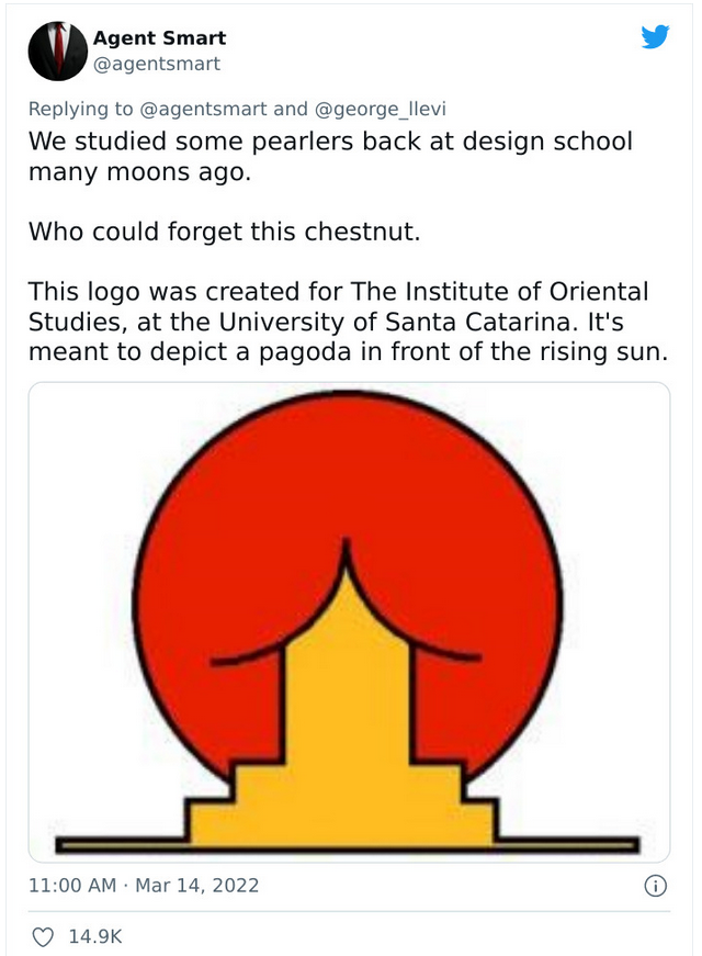
Thank you, gracious man! It’s even worse than I remember!
I tried searching for a while but wasn’t able to find one 😂🤣 it seems like everyone now uses multiple tiers/roofs specifically to avoid this issue
The original is mentioned in this great article https://velvetshark.com/ai-company-logos-that-look-like-buttholes
What a delightful read!
Why do AI company logos look like buttholes?
They look like black holes, cause they suck
everything in and nothing comes out.I’m pretty sure Groks logo actually is a black hole. I’ve got no idea what that’s got to do with AI but that does seem to be what it is.
I don’t know what co-pilots logo is supposed to be it just seems to be some coloured shapes
No, something does. It gets everywhere
Much like the POTUS.
2022-Present: The Butthole Era
Not just in logos, but also in enshitification in general.
Goatse flavor


